
Mitski’s The Land Is Inhospitable and So Are We
Design for Mitski’s 7th studio album, The Land Is Inhospitable and So Are We, released on September 15, 2023. The album has been described as “some of the most surreal, existential, and fascinating songs of Mitski’s career“ (Cat Zhang, Pitchfork)
Collaboration with Mitski.
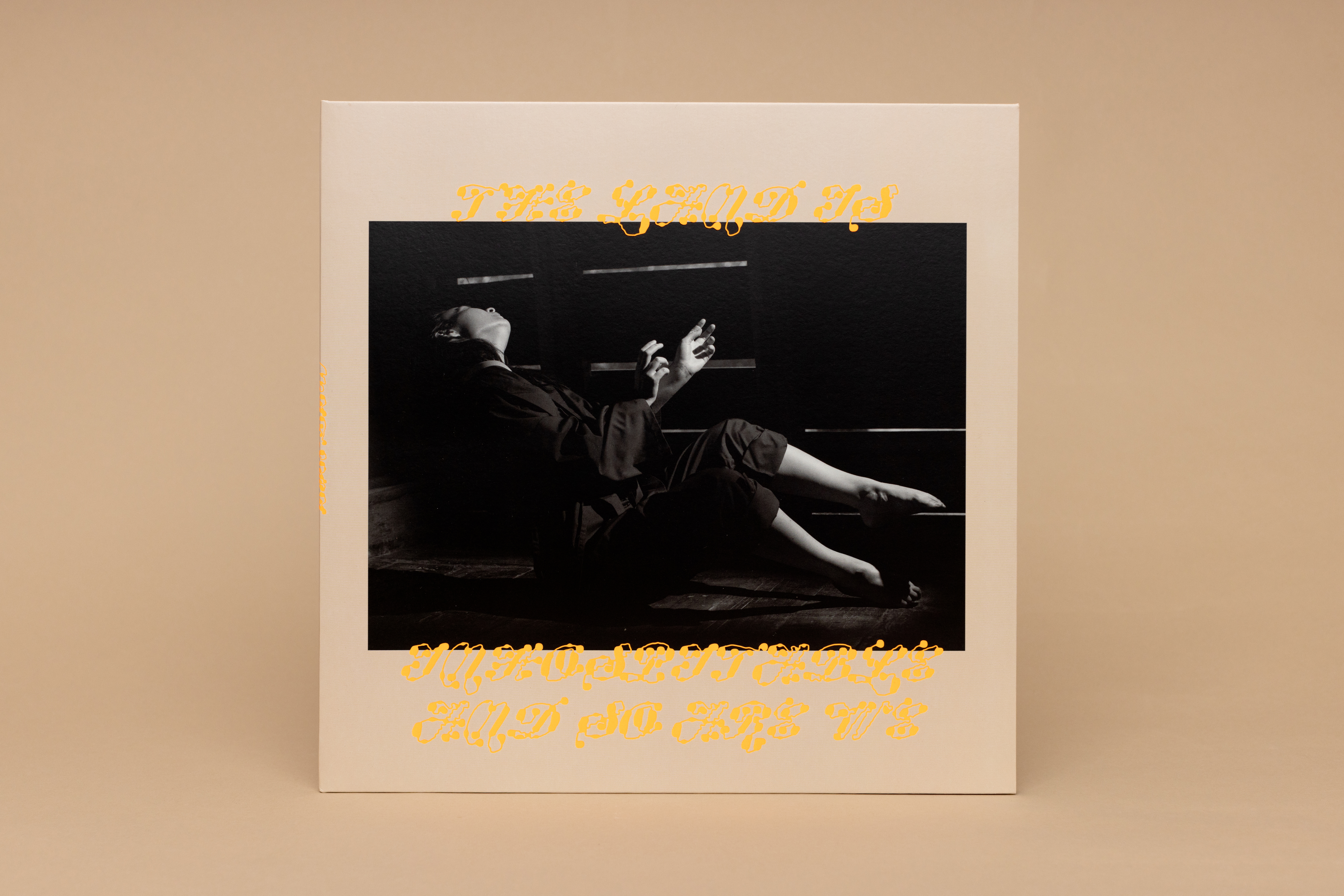
Photography Ebru Yildiz.
Typeface “Ready” by Plain Form and “Tofino” by Alanna Munro
All photos below with red background by Anna Powell Denton.
This process began with Ebru’s photographs (hundreds) and a playlist (normal size). Together they sparked a lot of ideas: dirt, dust, archaeological dig sites, mythology of “the road”, property, grids, weaving, and I became very interested in a Walker Evans photograph of a billboard. Some highlights from my notes include “a big stick” “fences” and “hand as land” — it all makes sense in the end, right?
For the typography, I wanted to express the idea of “unruly and free”, like the idea of the American Old West. Ready Active by Plain Form fit my vision of what “lawless typography” might be, and it follows that through in that it is always breaking the border of the image in the design. From the Ready specimen: "Ready does more than flirting with abstraction: it tips over into becoming pure shapes, only sprinkled with a few hints of our long-established and codified writing system.”
I spent a lot of time thinking about the album title, there are many ways the land and people are inhospitable—one literal thought I persued is the simple idea of the land rejecting a person walking on it, which conjured the image of shards poking out of the dirt. As the ocean erodes the land it reveals this physical evidence of the human experience—shards, bones, scraps of metal. The land is inhospitable because we made it inhospitable? The digital drawing of an early American jug (Weller pottery, 1872) became the formal representation of this, and as a graphic device helped carry the campaign across the many materials it demands.
The album package has two slip cases, one in aster pink and the other in robin egg blue. The pink slip is accompanied by a blue vinyl and the blue slip offers a pink vinyl. The peaceful nature of these hues is activated by an electrified orange*. Made even louder with a glossy spot, this hot orange functions as the molten core of the package with a full flood inside both slip cases. When the slip is empty, the two die cut shards on the cover light up like a freaky pollution sunset. Dark forest green functions as an alternative to black in an effort to respect the rich black of Ebru’s photo series. A sandy blush like the dry dirt kicked up in a dust storm grounds the rest of the artwork.
* Best viewed in person, the gamut for digital images does accomodate a color this hot!


Physical media with tactile embossing and hot and slick colors contrasting against Ebru’s intense images.

Label: Dead Oceans / Secretly (special thanks to Miles Johnson)
Management: Good Harbor (special thanks Tom Chiari & Ben Levin)
Management: Good Harbor (special thanks Tom Chiari & Ben Levin)
contact: mary.banas (at) gmail.com
1981–NOW © YES IS MORE, Mary Banas, specified rights holders. All Rights Reserved.
1981–NOW © YES IS MORE, Mary Banas, specified rights holders. All Rights Reserved.