Mitski’s Laurel Hell
Design for Mitski’s 6th studio album, Laurel Hell, select merch, and art direction for website, additional consulting on merch lines. Laurel Hell was released on February 4, 2022 and is categorized as synth-pop, indie pop and electro-rock.
In an interview with Variety, Mitski describes “Laurel Hell is a soundtrack for transformation, a map to the place where vulnerability and resilience, sorrow and delight, error and transcendence can all sit within our humanity, can all be seen as worthy of acknowledgment, and ultimately, love.”
Collaboration with Mitski.
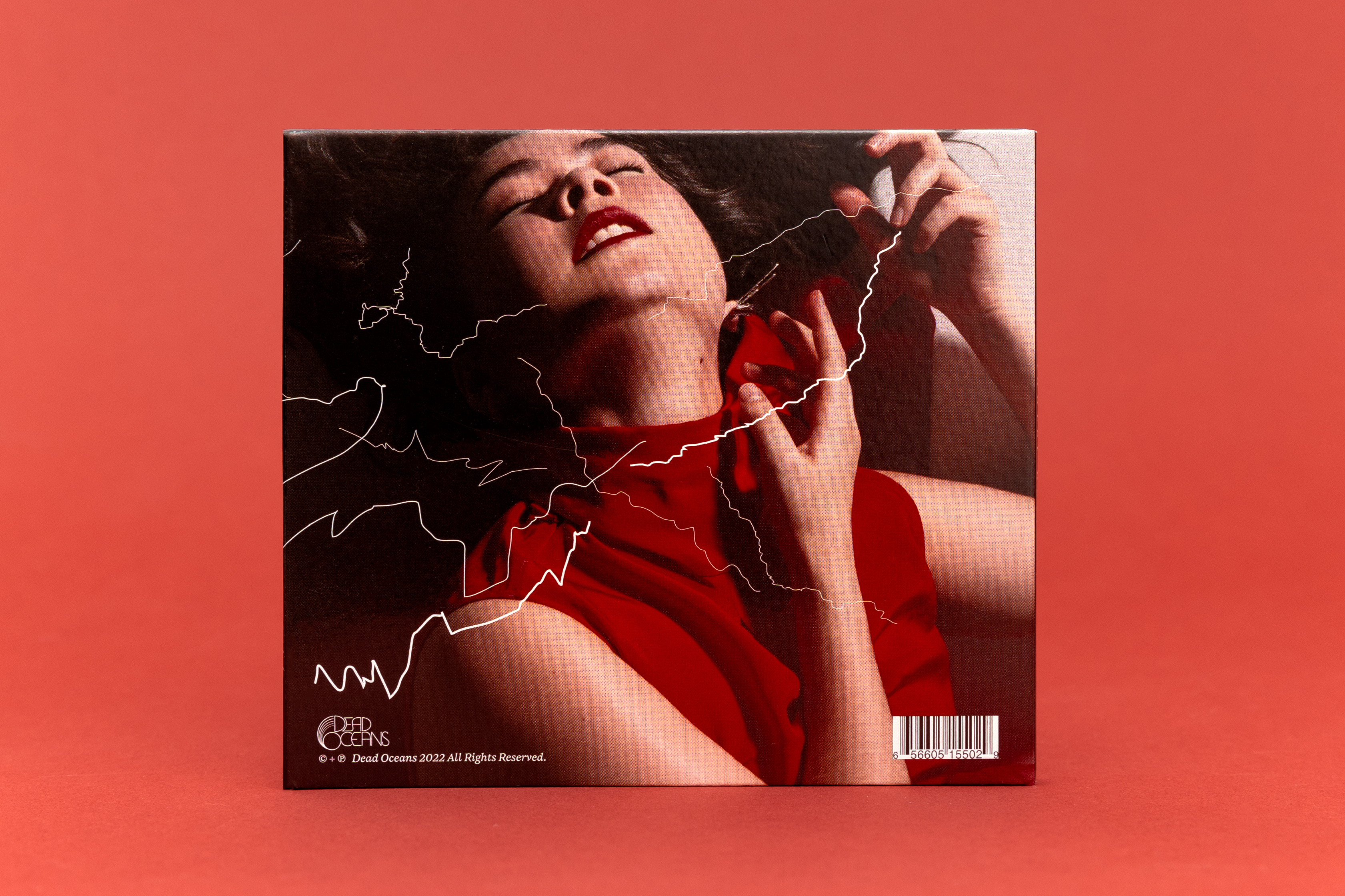
Photography Ebru Yildiz.
Typeface “Resolve” by Corinne Ang.
All photos below with red background by Anna Powell Denton.
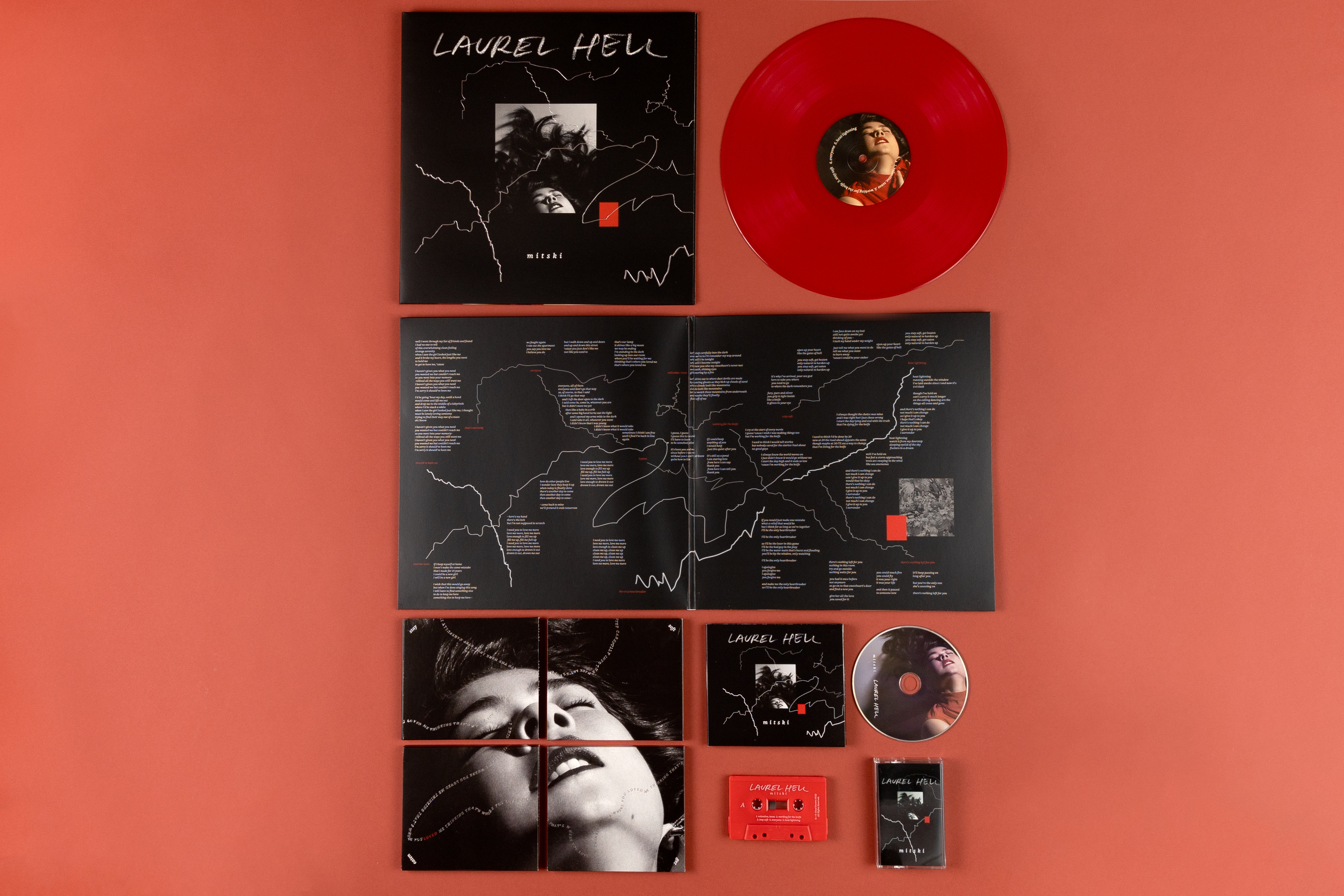
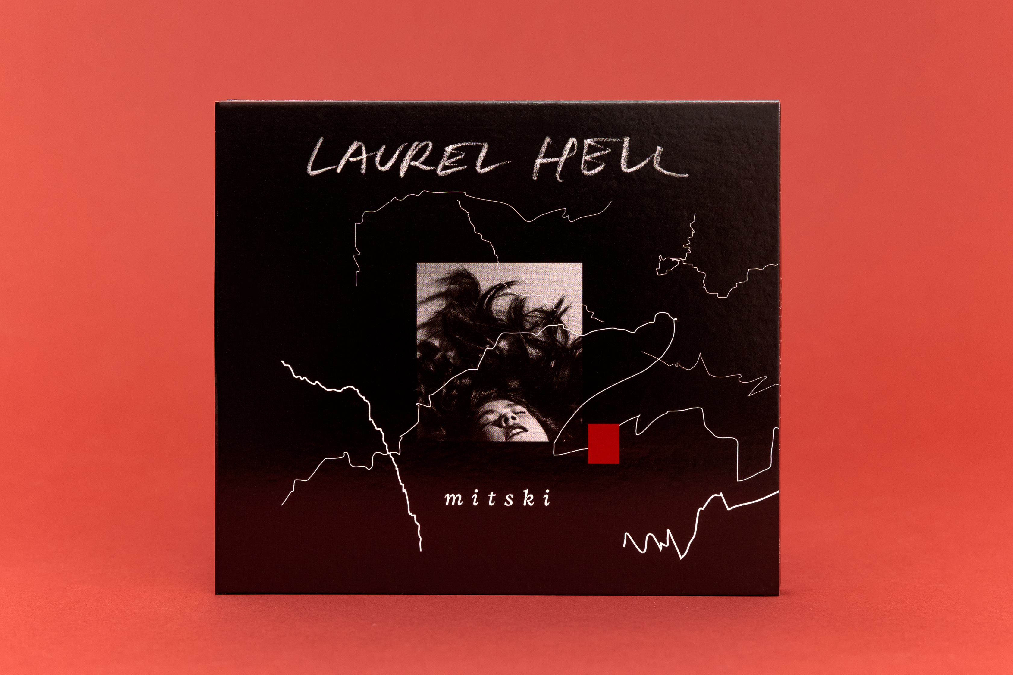
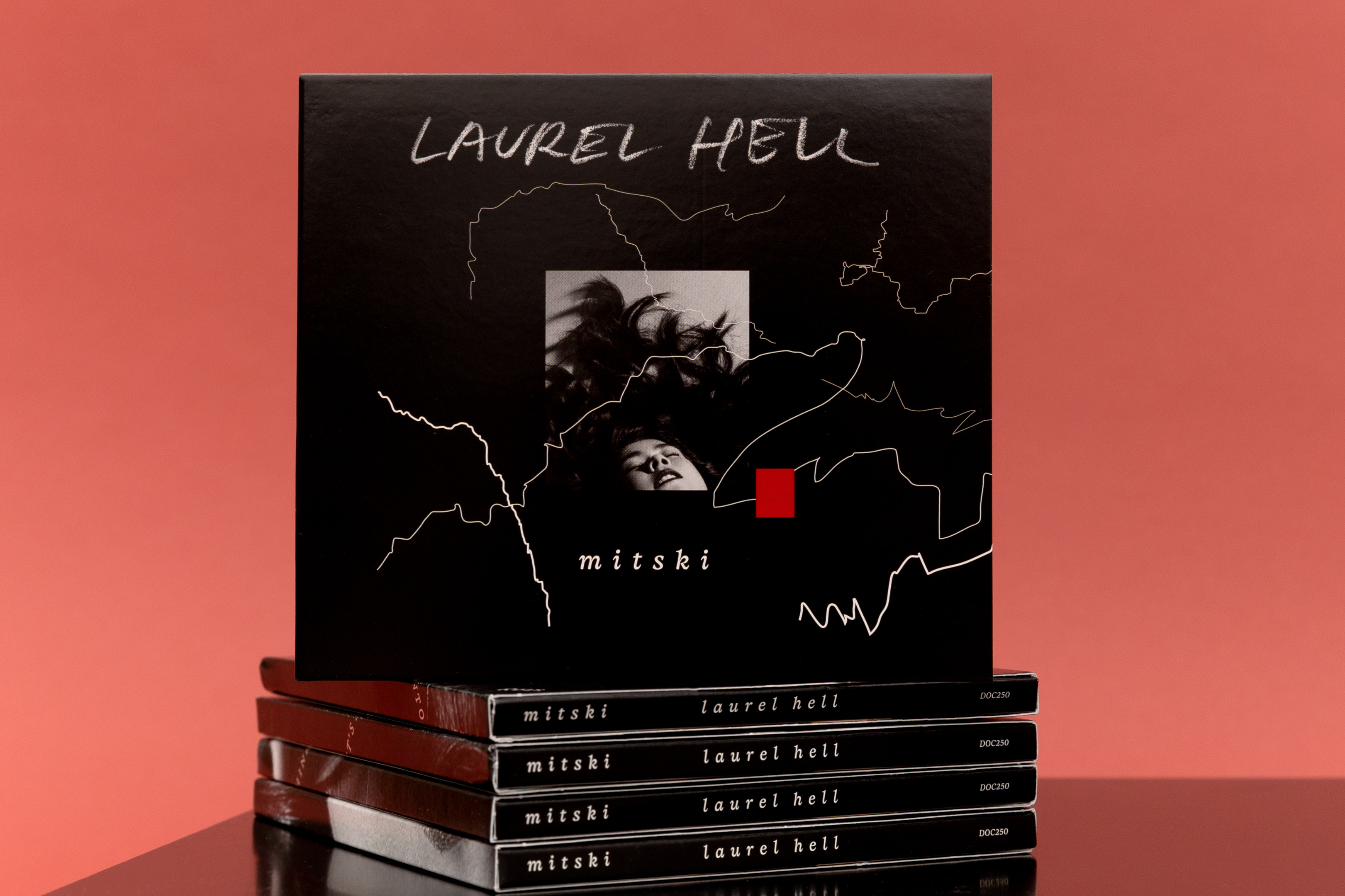
A line was drawn in response to each track on this album and is printed in shimmering (like “wet teeth, shining eyes”*) silver foil. These lines are, at the same time; lightening, evidence of a journey, and the tangled branches of a mountain laurel bush (so thick and overgrown you can’t escape it—the namesake of this record), and when layered with Yildiz’s photography portray an emotional state between agony and ecstasy. Upon opening the record package the silver marks reveal a complex and tangled map on which the lyrics coax a reader along a tumultuous personal journey.
Intentionally, a single photographic representation of Mitski is used for all the music packaging. Side A and B of the record label also feature Yildiz’s singlular image, on side A the portrait of Mitski is clear, while side B presents her likeness buried under a mess of laurel leaves.
As elegant as it is fierce, the typeface “Resolve” by Corinne Ang and was chosen for it’s attributes, as described “stubborn & grounded, not delicate nor fragile” and how it “reveals a bittersweet sharpness to accompany the everflowing swerving curves”. Practically, the typeface performs well at both very small and large sizes, and formally the expert craft reflects the quality of the music, writing and production on Laurel Hell.
*Valentine, Texas
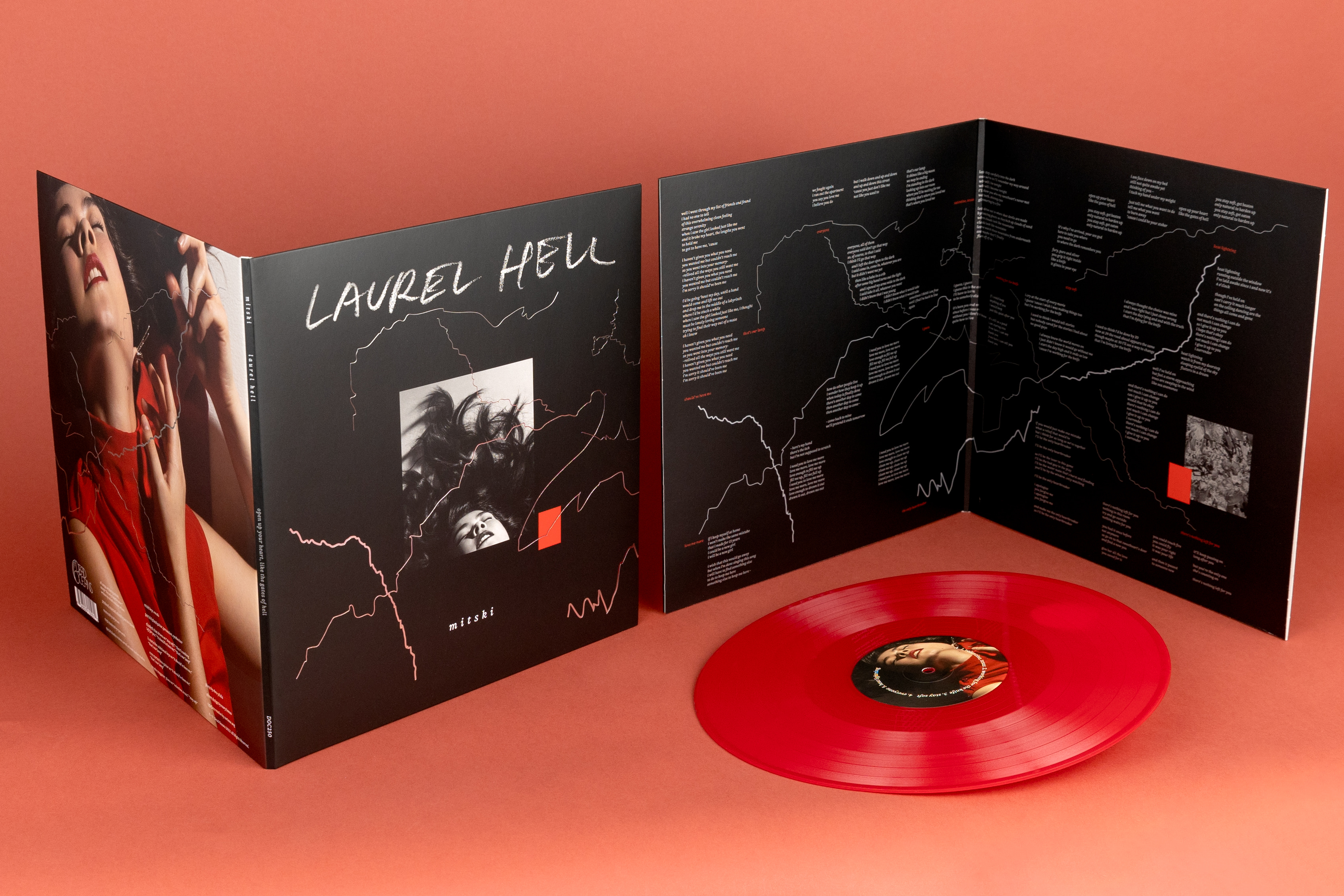
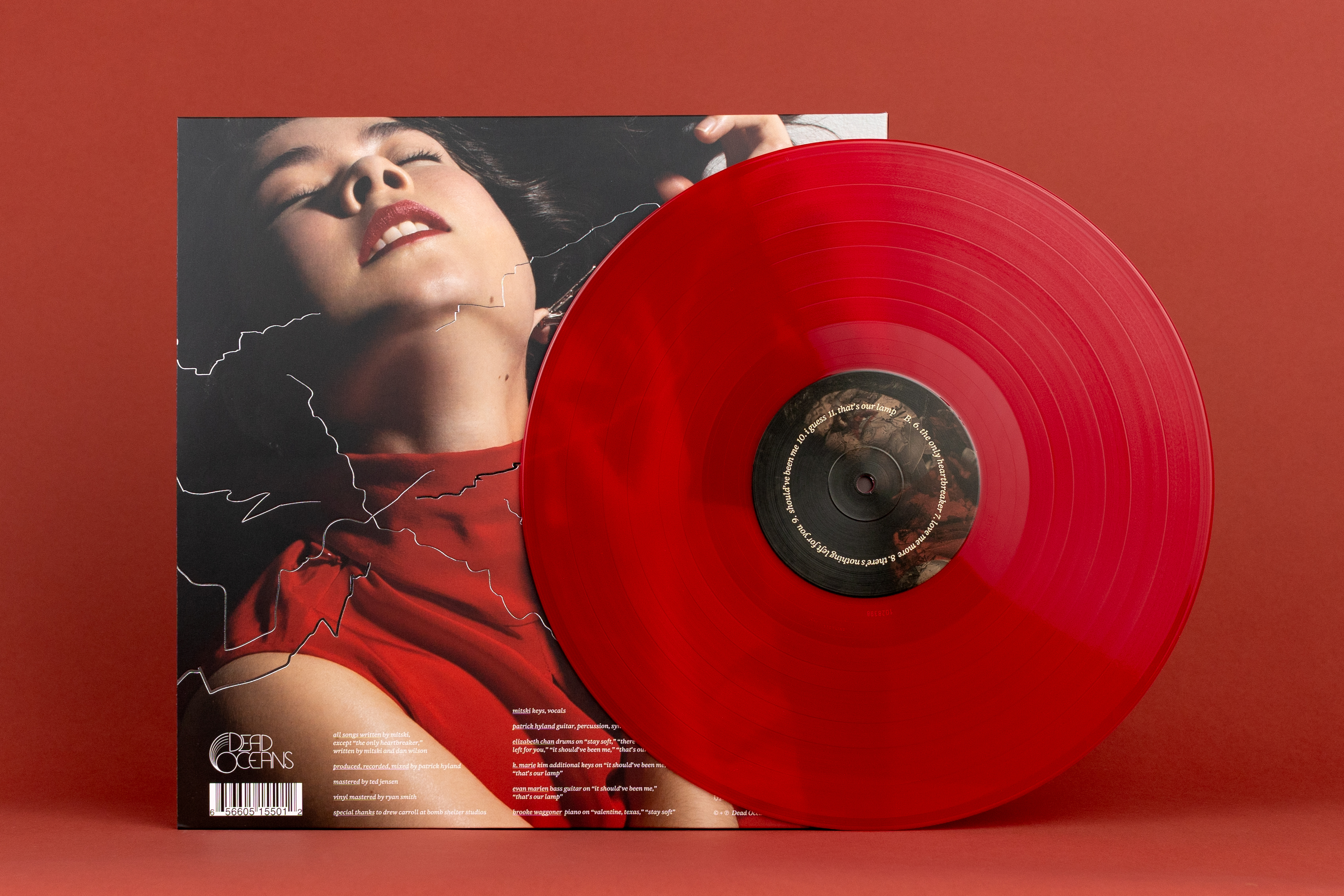
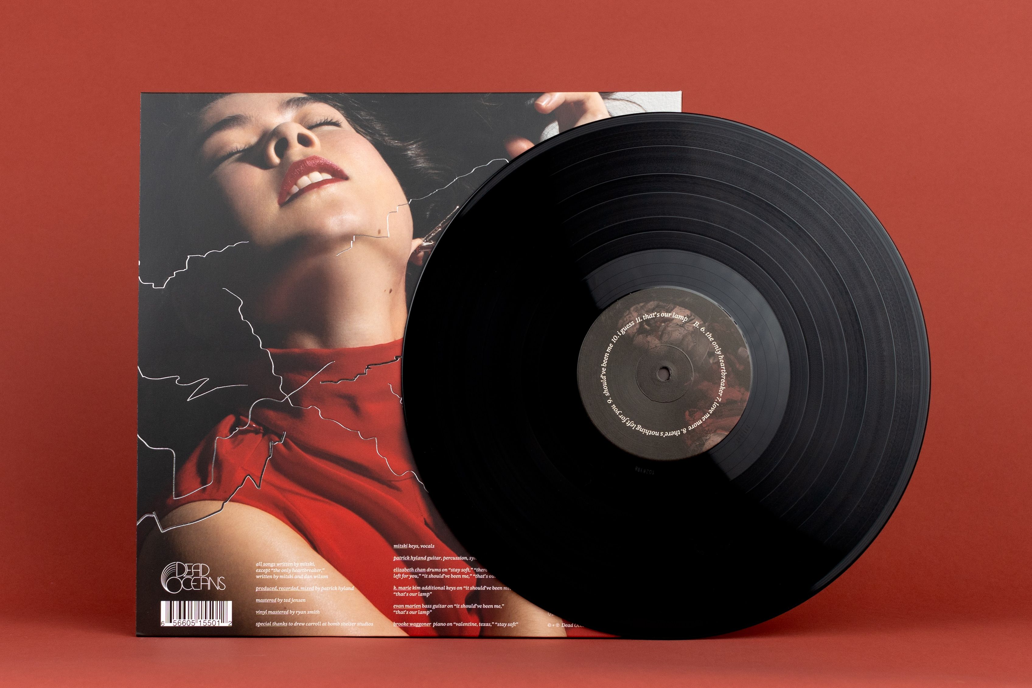
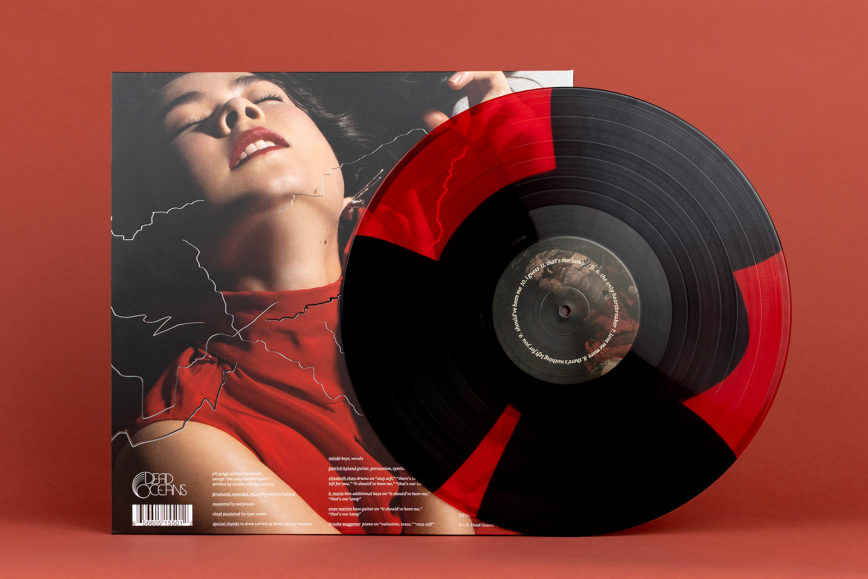
Above: Primary record package design, red vinyl; black vinyl, triple button red and black vinyl
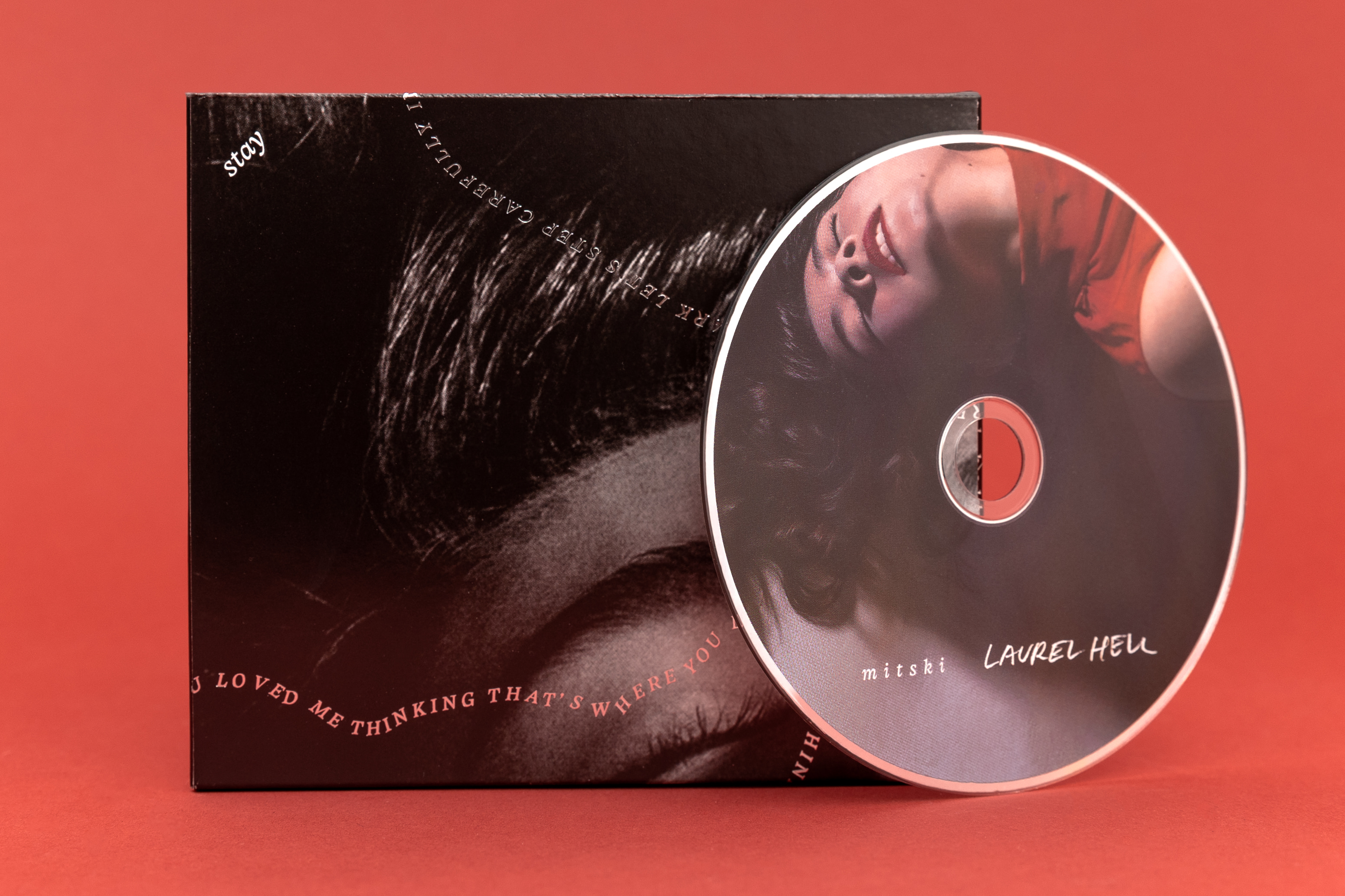
Above: CD package design
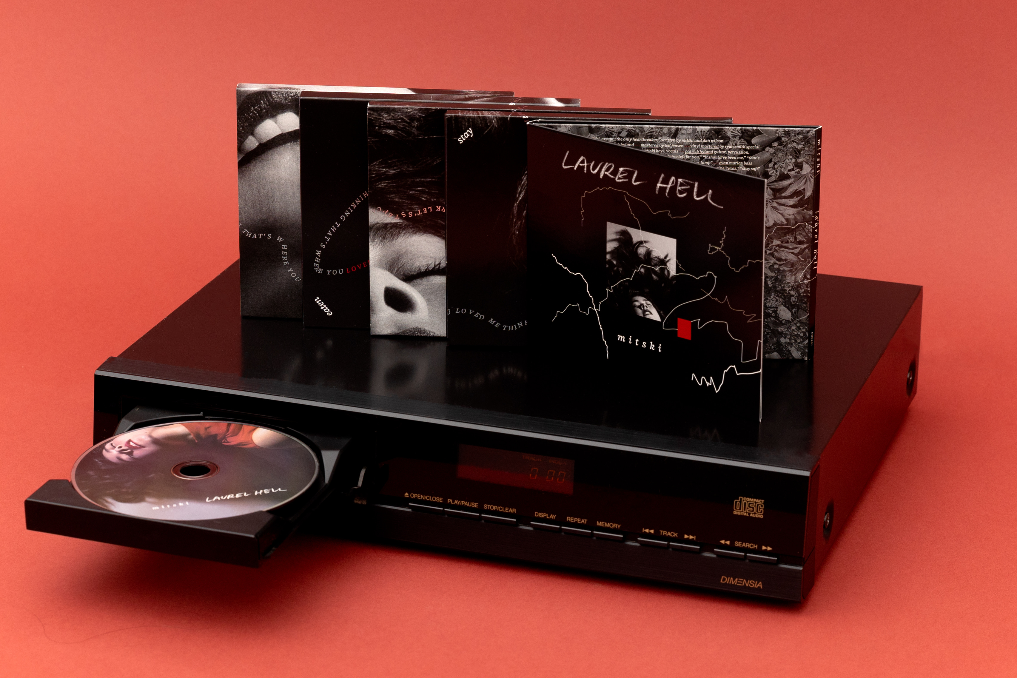
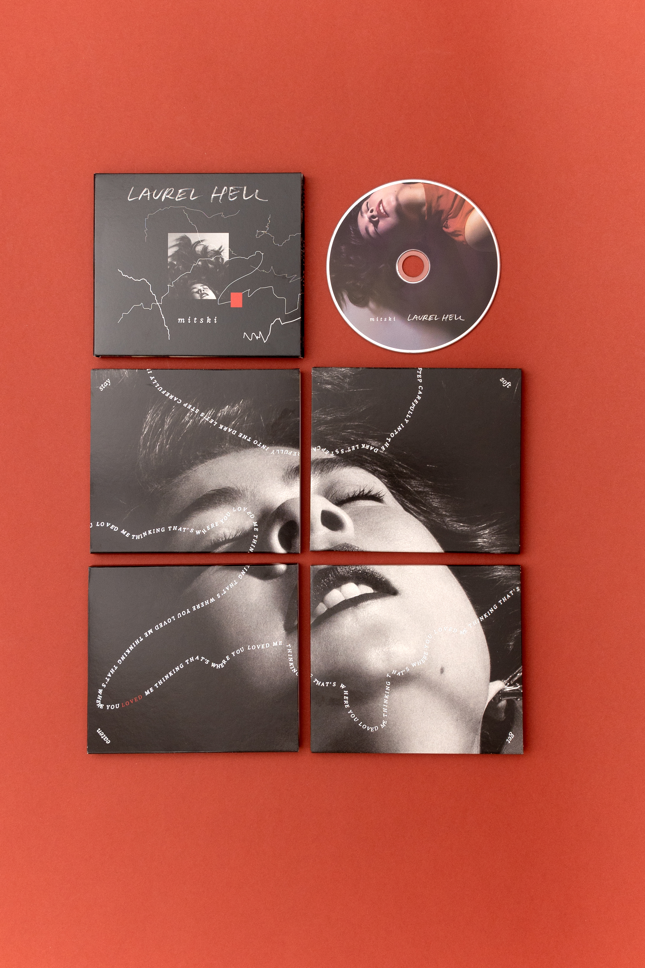
Above: variant CD slip case design: “stay” “soft” “get” and “eaten” reveal a new crop of Yildiz’s iconic portrait of the artist.
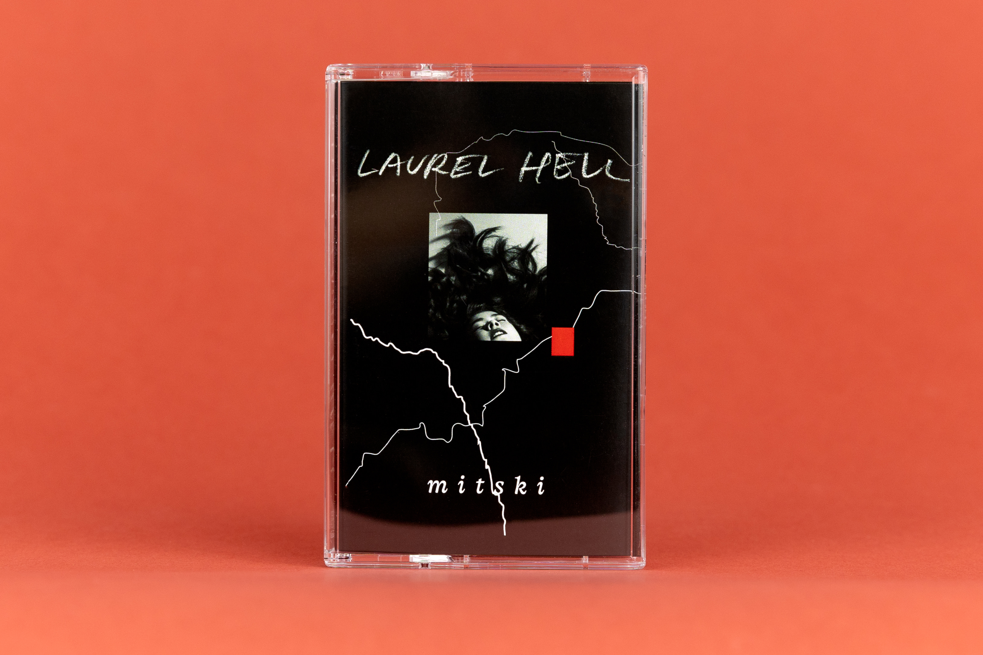

Above: cassette package design: when closed, the track list and cassette title present opposing reading experiences — neither is right side up, hopefully frustrating the consumer
Work includes:
—Vinyl Laurel Hell US
—Vinyl Laurel Hell UK (Rough Trade exclusive)
—Vinyl Stay Soft, Get Eaten: Laurel Hell Demos (Rough Trade exclusive)
—Vinyl variant specifications (all records world wide, standard retail variant, DTC exclusive, Secretly Society Album of the Month, Rough Trade album of the month, Vinyl Me Please, Japan, Mitski Store)
—CD
—Set of 4 limited edition CD slip cases
—Cassette tape
—Digital album cover (design optimised for for music platforms)
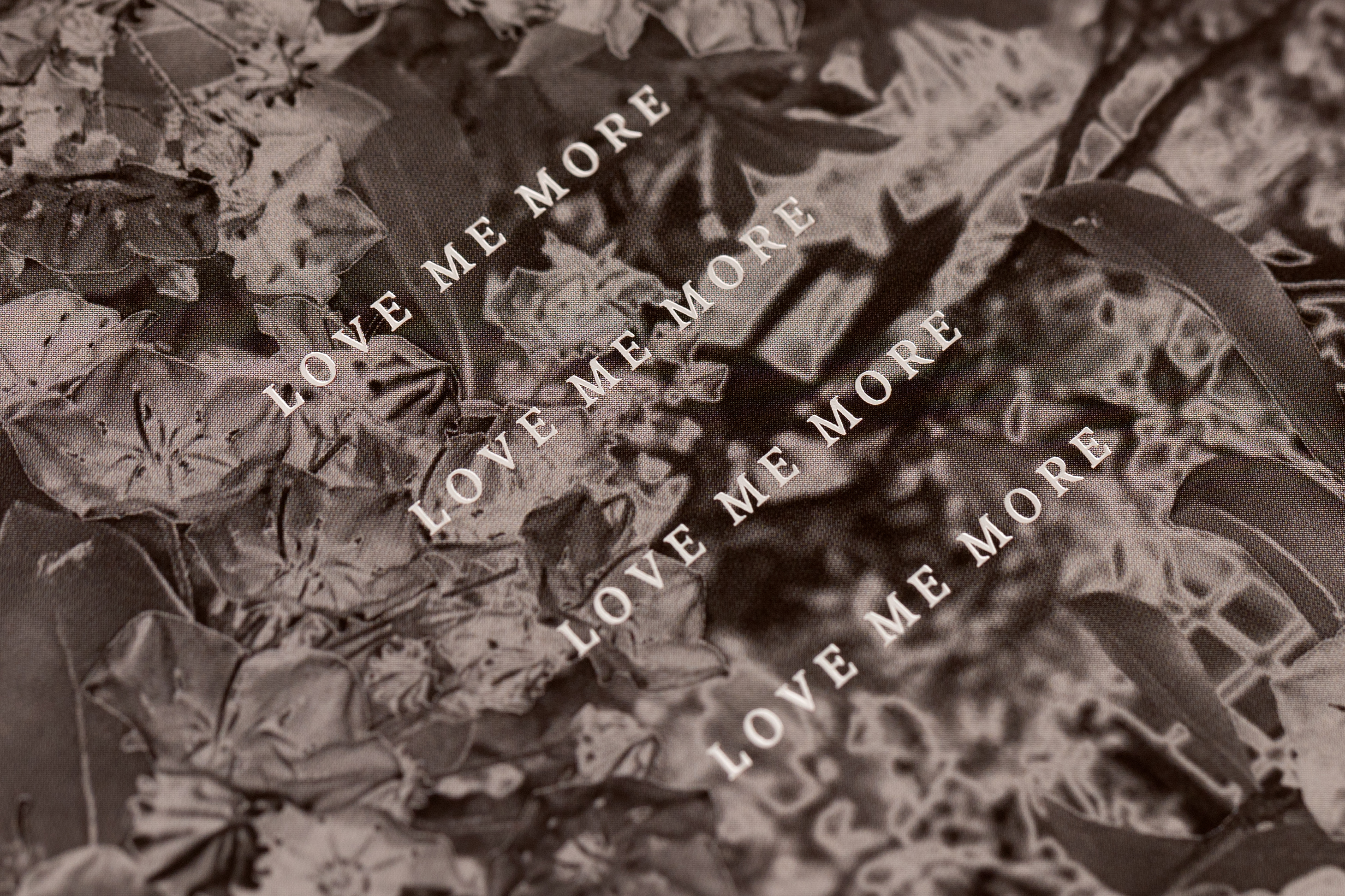
—Digital singles for Working for the Knife, The Only Heartbreaker, Heat Lightning, Love Me More
—Digital art for Love Me More (Clark Remix)
— Custom lettering and font for album art and website
—Poster
—Series of 5 Mystery T’s
—Dust Devils shirt
—Secretly Shirt
—Commemorative dice set
Label: Dead Oceans / Secretly (special thanks to Miles Johnson)
Management: Good Harbor (special thanks Tommy John Chiari & Ben Levin) previously Salty (special thanks Chris Crowley)
Merch: Second City Prints (special thanks to Emily and Carly)
—Vinyl Laurel Hell US
—Vinyl Laurel Hell UK (Rough Trade exclusive)
—Vinyl Stay Soft, Get Eaten: Laurel Hell Demos (Rough Trade exclusive)
—Vinyl variant specifications (all records world wide, standard retail variant, DTC exclusive, Secretly Society Album of the Month, Rough Trade album of the month, Vinyl Me Please, Japan, Mitski Store)
—CD
—Set of 4 limited edition CD slip cases
—Cassette tape
—Digital album cover (design optimised for for music platforms)
—Digital singles for Working for the Knife, The Only Heartbreaker, Heat Lightning, Love Me More
—Digital art for Love Me More (Clark Remix)
— Custom lettering and font for album art and website
—Poster
—Series of 5 Mystery T’s
—Dust Devils shirt
—Secretly Shirt
—Commemorative dice set
Label: Dead Oceans / Secretly (special thanks to Miles Johnson)
Management: Good Harbor (special thanks Tommy John Chiari & Ben Levin) previously Salty (special thanks Chris Crowley)
Merch: Second City Prints (special thanks to Emily and Carly)
contact: mary.banas (at) gmail.com
1981–NOW © YES IS MORE, Mary Banas, specified rights holders. All Rights Reserved.
1981–NOW © YES IS MORE, Mary Banas, specified rights holders. All Rights Reserved.