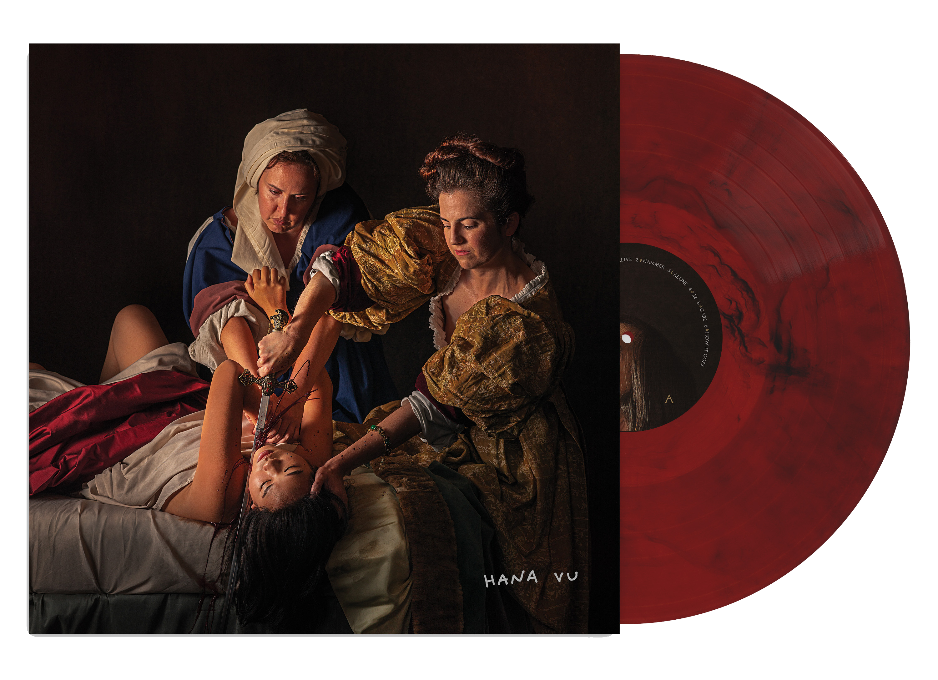
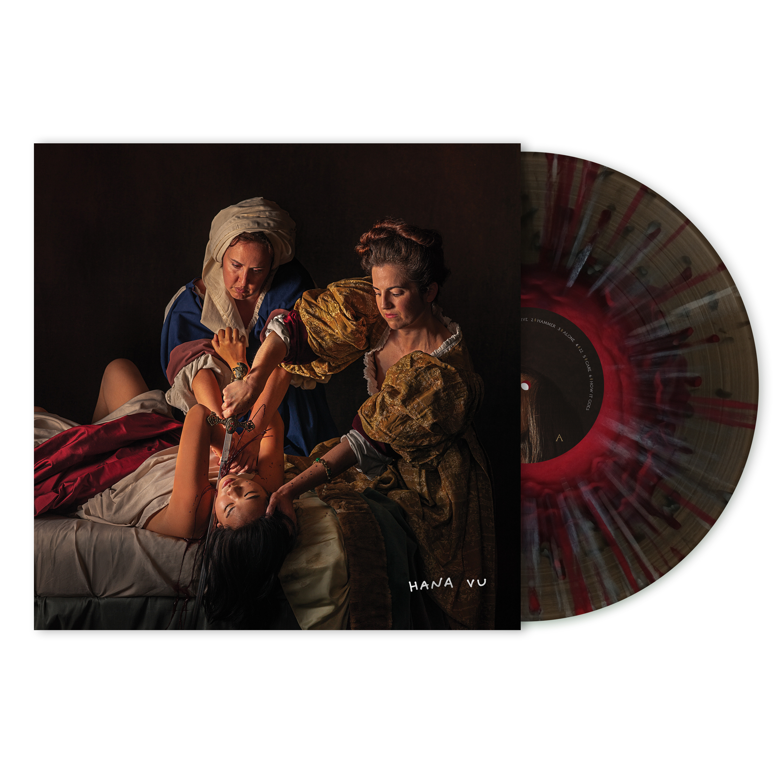
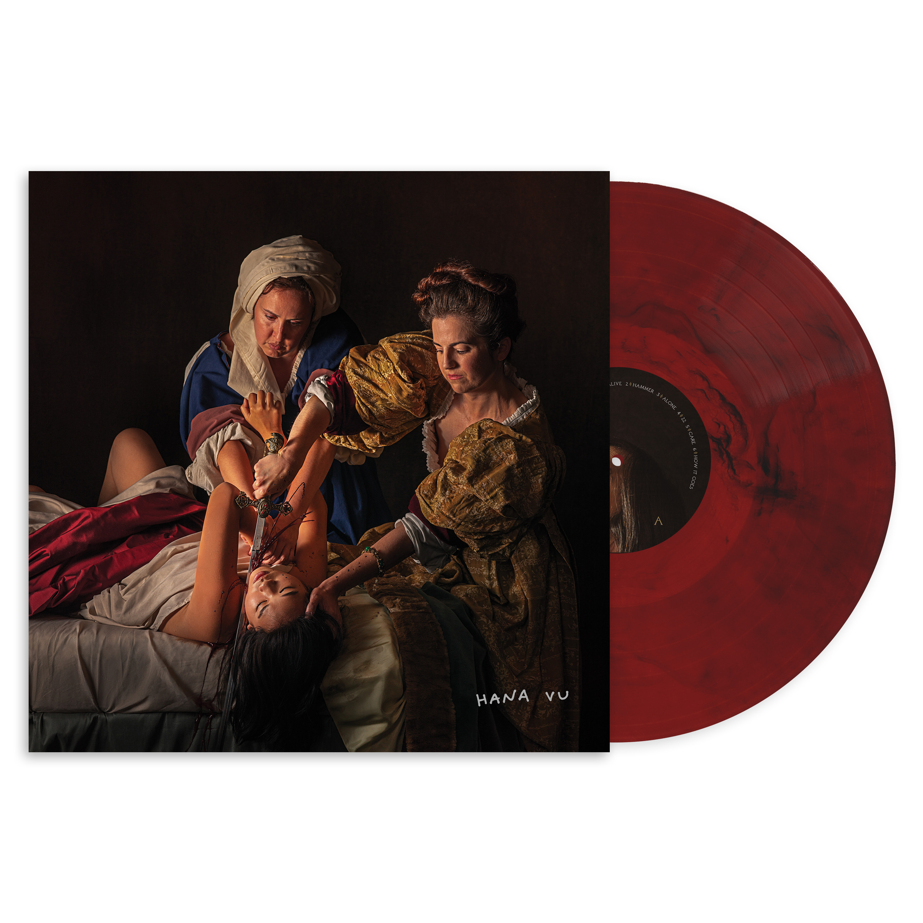
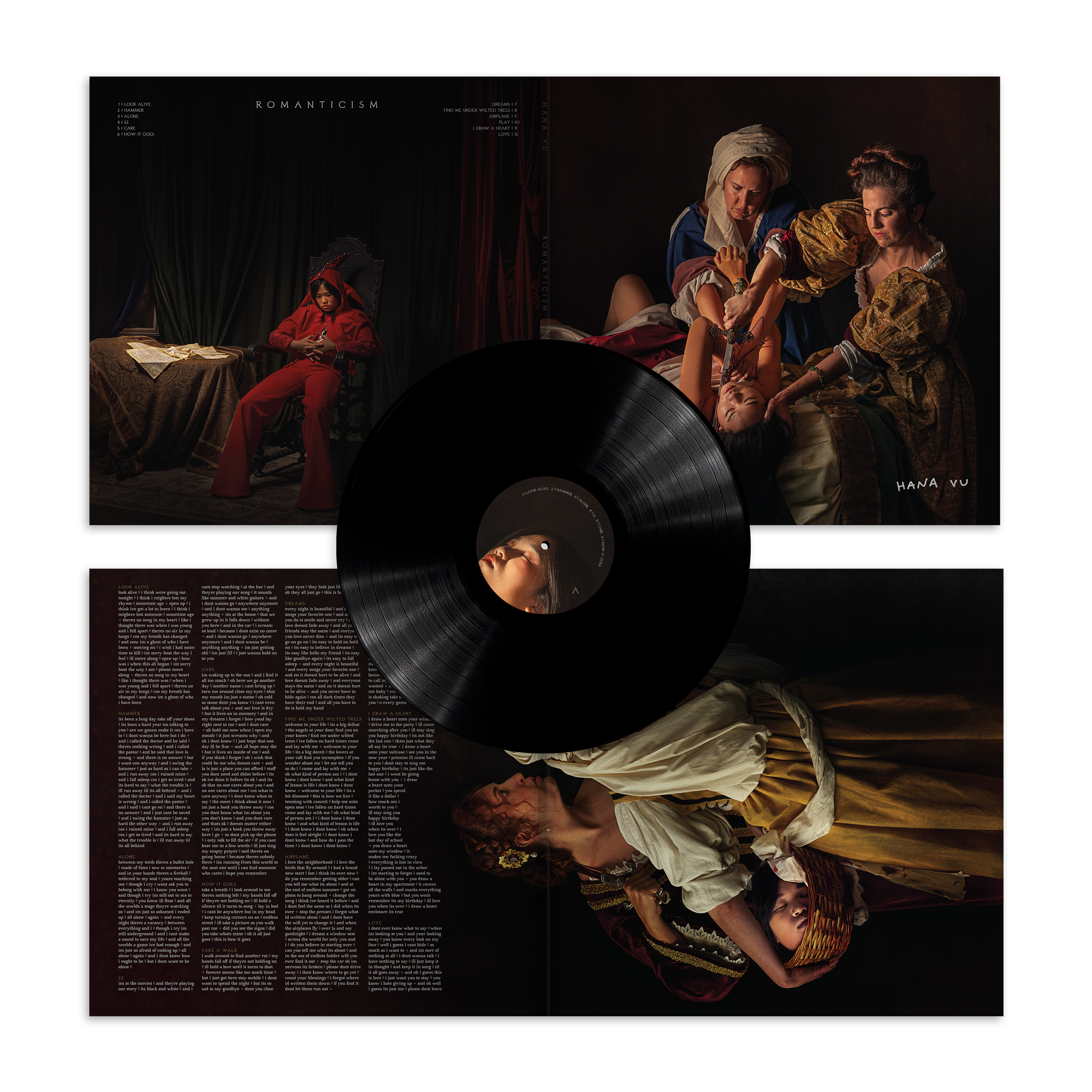
Hana Vu’s Romantiscm
Vinyl package design for Hana Vu’s 2nd studio album Romanticism.
Described as “guitar-driven synthy pop and plush contralto fill out the coming-of-age experience with slick and sorrowful precision. These songs pulse with meaning and jolt with playfulness, anchored by her powerful, sonorous voice.” and “Romanticism can feel both reminiscent of guitar-heavy late-aughts indie rock, and expansively futuristic in its layered synth bass. Vu adds, ‘I’m just trying to convey my perspective as boldly as possible. To succinctly crystallize how it feels to be young, but also to be deeply sad.’” (excerpts from album description by Kyle Lucia Wu)
Collaboration with Maegan Houang + Hana Vu
Visual art credits:
Creative Direction: Maegan Houang
Photography by Christopher Ripley and Maegan Houang
Type:
Daubenton by Olivier Dolbeau
Avara (Contributers: Raphaël Bastide Wei Huang Lucas Le Bihan Jérémy Landes Walid Bouchouchi)
Label: Ghostly International, special thanks to Molly Smith
Management: Max Dubois, Gold Theory
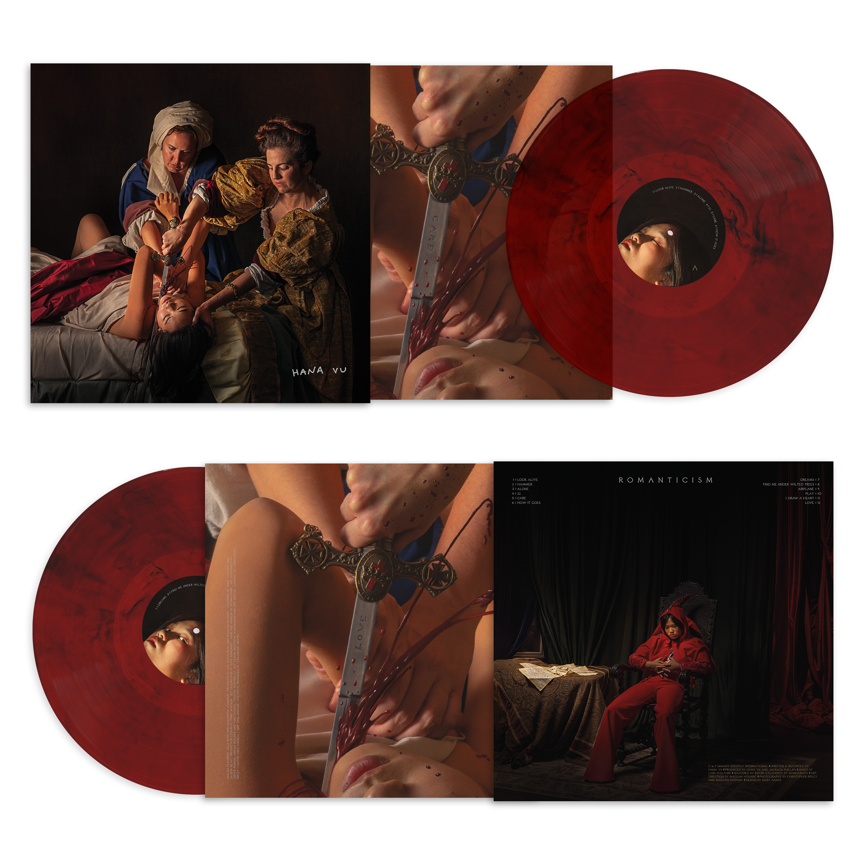
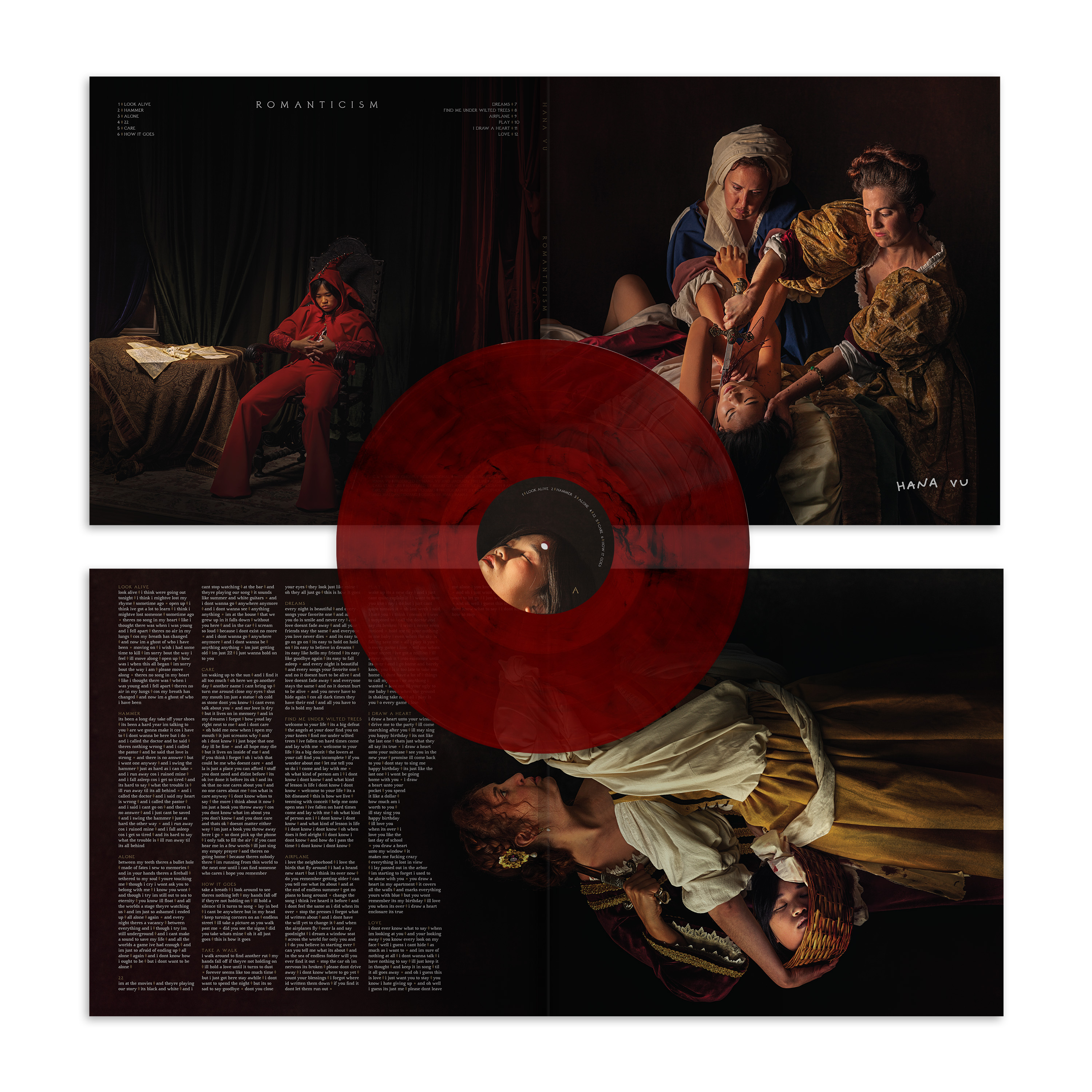
Ruby red vinyl (global variant)
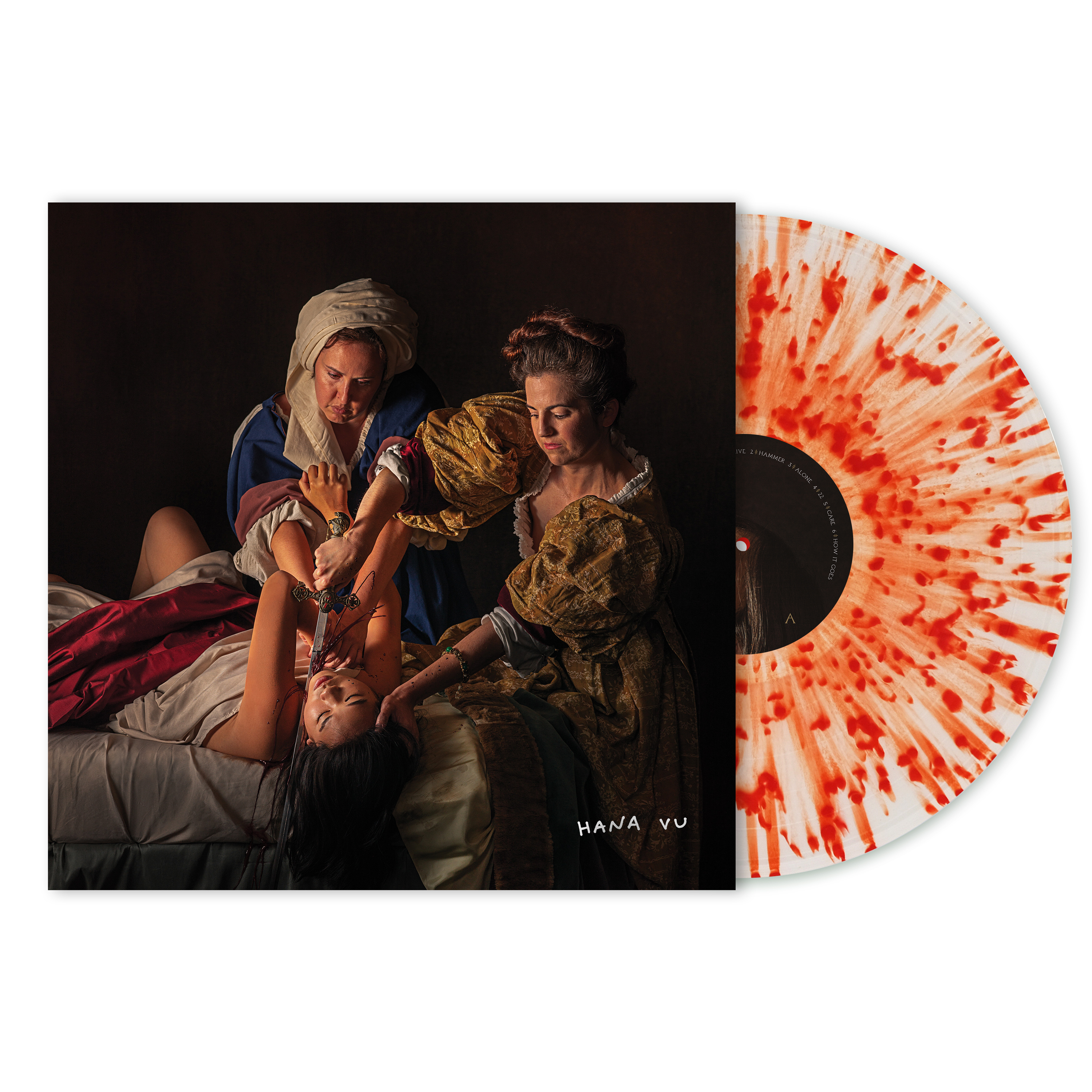
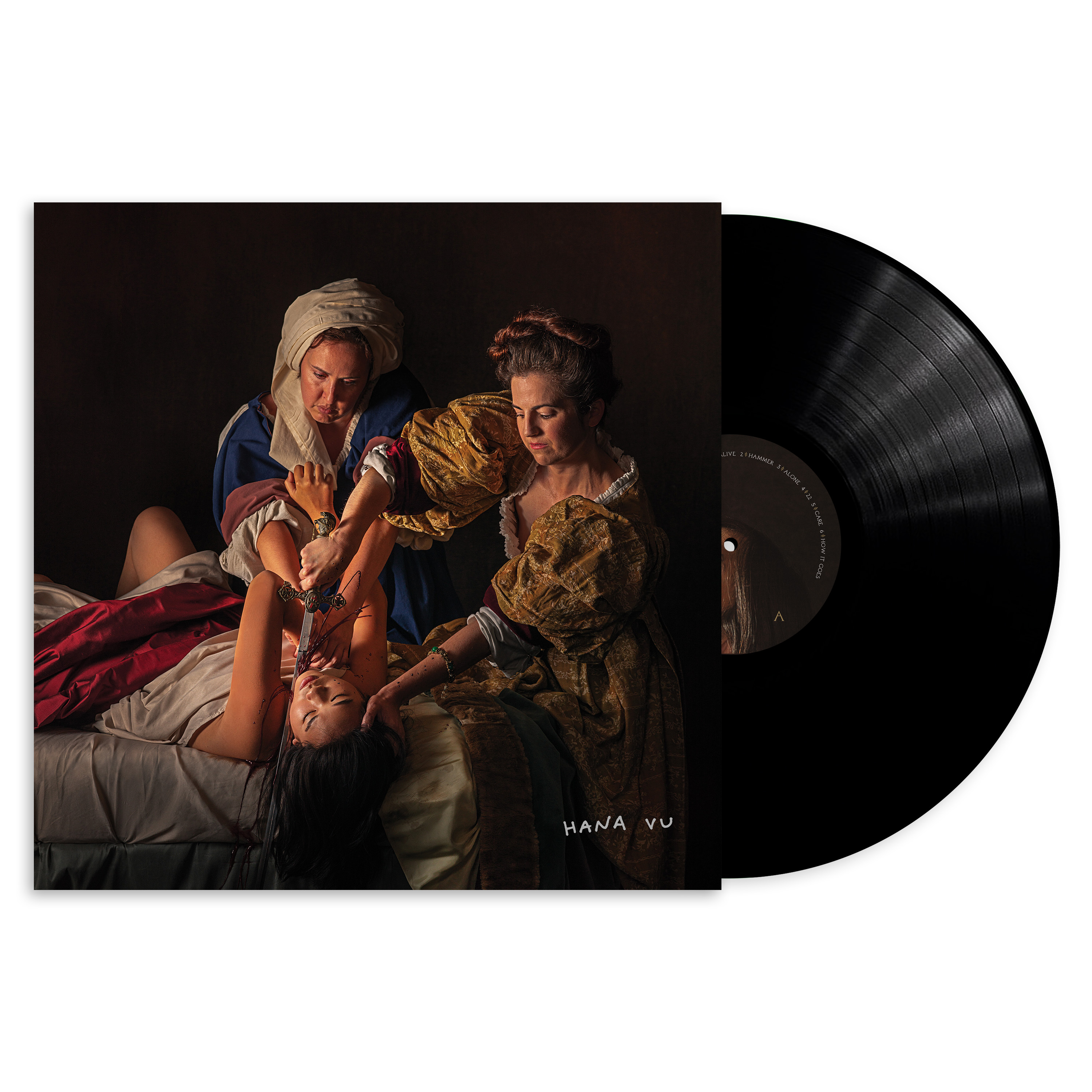
Standard offering — black vinyl

MMXX
Limited edition design by Zak Jensen and Mary Banas for the Collab tab on Everpress

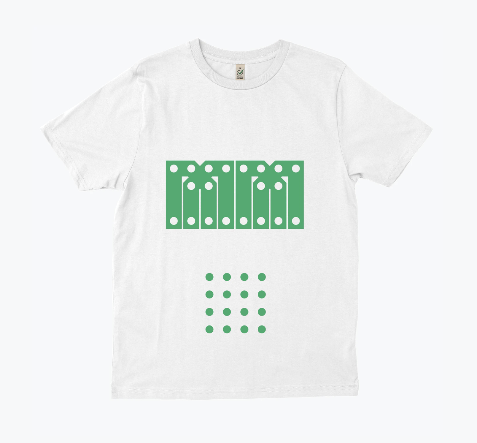
This shirt is about different ways of forming connections. Zak and I haven’t lived in the same place for years, so staying in touch requires some effort and creativity. Now, in quarantine, this is true for most relationships everywhere. The reference that spurred the design in this direction came from an unlikely source; New York’s Governor Andrew Cuomo, who advised people to “be socially distant, but spiritually connected”. A shirt won’t change things, but the process of making it was one way for each of us to stay in touch with a friend. MMXX is 2020.
https://everpress.com/mmxx
https://everpress.com/mmxx
Good Glyphs
Project by Calvin Waterman/Violet Office
A dingbat font created by 32 designers. All proceeds go to Doctors Without Borders. GOOD GLYPHS is licensed under SIL Open Font License.
Premise text from Violet Office:
We (Violet Office) are asking for your help to make something that does a little good! As lockdowns have tightened their grip and the global impact is coming into focus, our need to give back has become paramount. We see a unique opportunity to bring a group of amazing designers together to create a fundraising tool that plays into our collective strengths and transcends our physical limitations. Our proposal is GOOD GLYPHS.
GOOD GLYPHS will be a dingbat typeface created from artwork by 36 designers. Historically dingbats have been a way to package and share graphic symbols. We’re hoping to adapt the format to collaboratively create the dingbat font of 2020. We view this as a collection of artwork akin to a digital gallery.
Obviously, we want to create a fucking rad dingbat typeface that activates artworks and pushes positive vibes into the world, but the bigger goal is to use our collective creativity to raise money for people that need our support!
My Description (c. 2020)
I became interested in the idea of voids and black holes in January 2017. Black holes are a place of ultimate darkness—they suck energy. It felt like the right symbol for the news cycle at the time, and my emotional response to the state of the nation. Lately, I have been thinking of the void more as the “unknown” and how life keeps asking me to be comfortable with not knowing. The most optimistic person I know is my Grandmother. She's 95 years old and also named Mary Banas and right now is in the hospital with the coronavirus. When I was growing up, she would often “see faces” in inanimate objects — like a cloud or a tree. My siblings and I would look for the face, sometimes we could see it, other times not. She also had an affinity for the iconic “smiley face” and would stick them on the back of envelopes when she sent me mail. As a young designer, I thought smiley faces were too soft, not intellectual enough. At some point, I realized the smiley is the most important graphic shorthand we have.


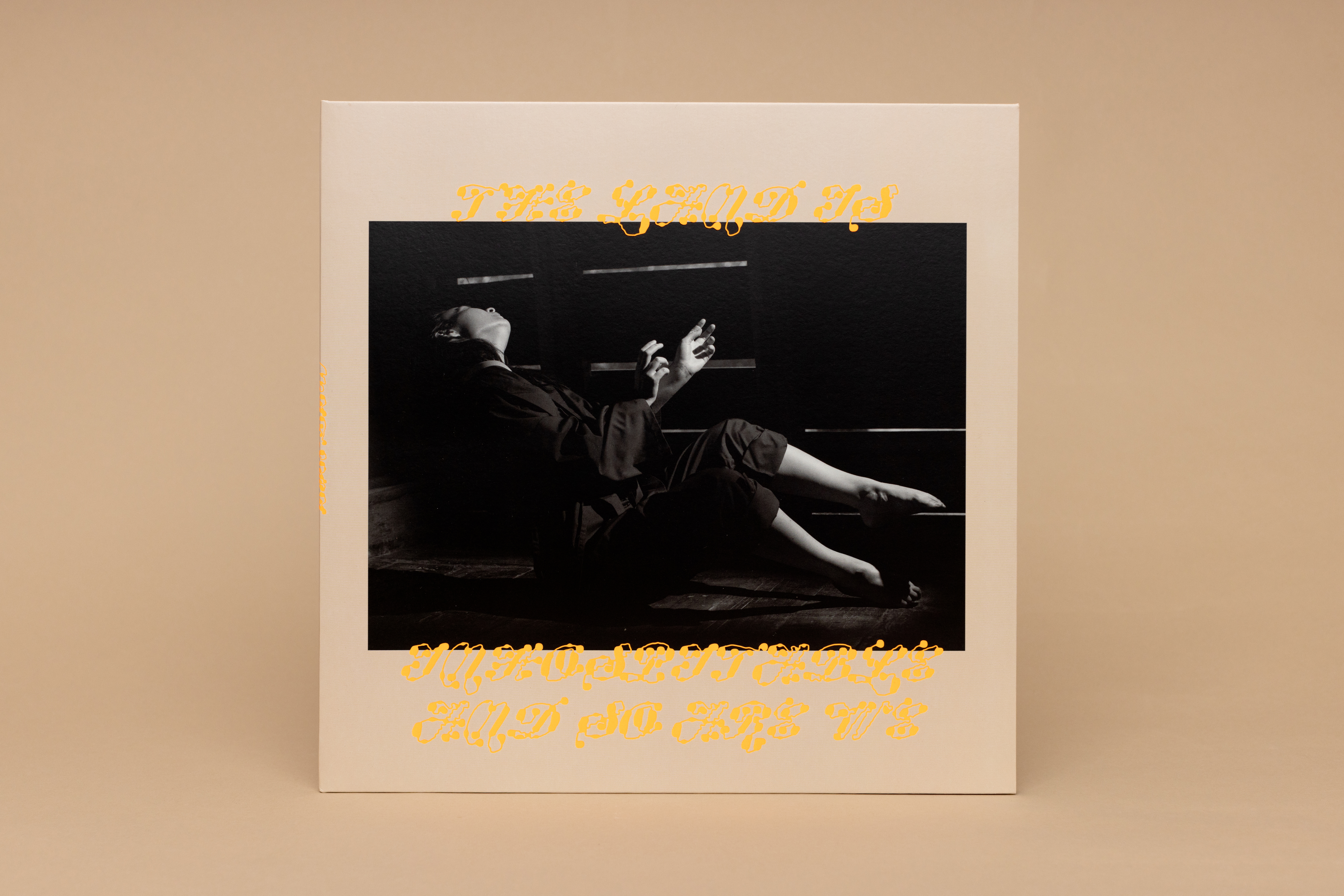
Mitski’s The Land Is Inhospitable and So Are We
Design for Mitski’s 7th studio album, The Land Is Inhospitable and So Are We, released on September 15, 2023. The album has been described as “some of the most surreal, existential, and fascinating songs of Mitski’s career“ (Cat Zhang, Pitchfork)
Collaboration with Mitski.
Photography Ebru Yildiz.
Typeface “Ready” by Plain Form and “Tofino” by Alanna Munro
All photos below with red background by Anna Powell Denton.
This process began with Ebru’s photographs (hundreds) and a playlist (normal size). Together they sparked a lot of ideas: dirt, dust, archaeological dig sites, mythology of “the road”, property, grids, weaving, and I became very interested in a Walker Evans photograph of a billboard. Some highlights from my notes include “a big stick” “fences” and “hand as land” — it all makes sense in the end, right?
For the typography, I wanted to express the idea of “unruly and free”, like the idea of the American Old West. Ready Active by Plain Form fit my vision of what “lawless typography” might be, and it follows that through in that it is always breaking the border of the image in the design. From the Ready specimen: "Ready does more than flirting with abstraction: it tips over into becoming pure shapes, only sprinkled with a few hints of our long-established and codified writing system.”
I spent a lot of time thinking about the album title, there are many ways the land and people are inhospitable—one literal thought I persued is the simple idea of the land rejecting a person walking on it, which conjured the image of shards poking out of the dirt. As the ocean erodes the land it reveals this physical evidence of the human experience—shards, bones, scraps of metal. The land is inhospitable because we made it inhospitable? The digital drawing of an early American jug (Weller pottery, 1872) became the formal representation of this, and as a graphic device helped carry the campaign across the many materials it demands.
The album package has two slip cases, one in aster pink and the other in robin egg blue. The pink slip is accompanied by a blue vinyl and the blue slip offers a pink vinyl. The peaceful nature of these hues is activated by an electrified orange*. Made even louder with a glossy spot, this hot orange functions as the molten core of the package with a full flood inside both slip cases. When the slip is empty, the two die cut shards on the cover light up like a freaky pollution sunset. Dark forest green functions as an alternative to black in an effort to respect the rich black of Ebru’s photo series. A sandy blush like the dry dirt kicked up in a dust storm grounds the rest of the artwork.
* Best viewed in person, the gamut for digital images does accomodate a color this hot!


Physical media with tactile embossing and hot and slick colors contrasting against Ebru’s intense images.

Label: Dead Oceans / Secretly (special thanks to Miles Johnson)
Management: Good Harbor (special thanks Tom Chiari & Ben Levin)
Management: Good Harbor (special thanks Tom Chiari & Ben Levin)
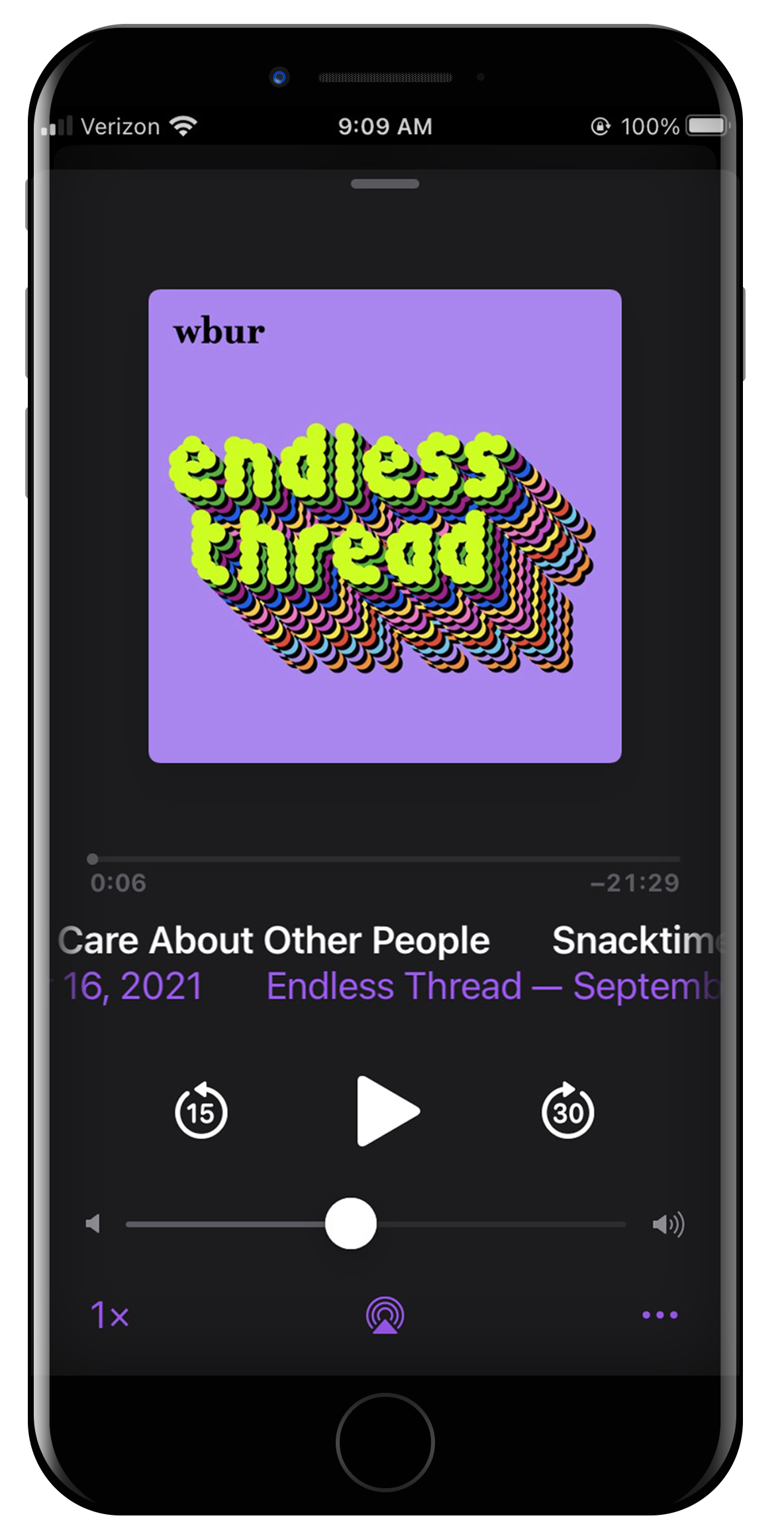
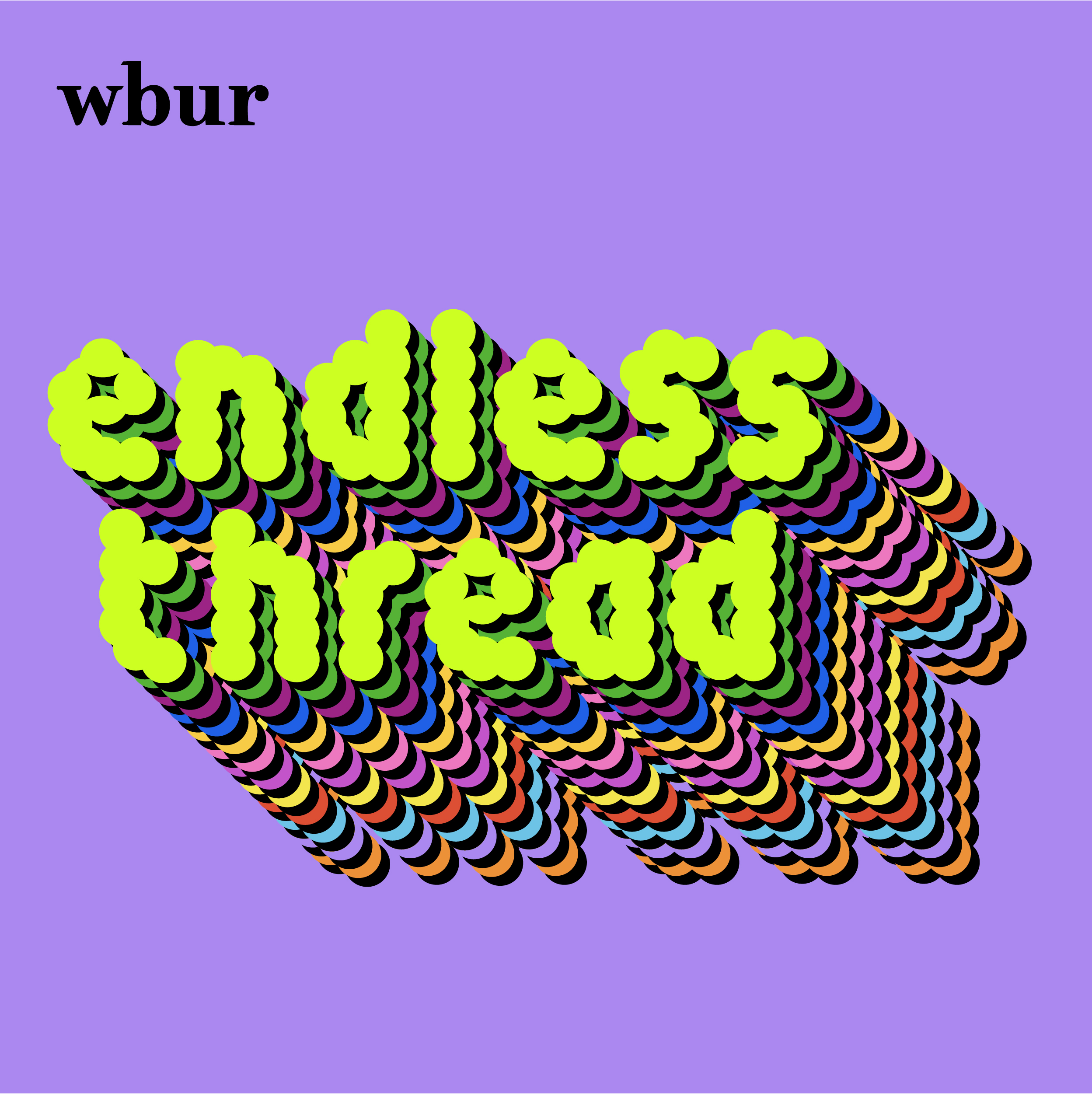
Endless Thread identity
2021
A new identity for WBUR’s Endless Thread podcast designed with Elena Foraker.
Animations by Mark Buenafe directly inspired by the end scene in the 1990’s computer game Microsoft Solitaire.
The type is a modified version of TINY by Jack Fahnestock.
About Endless Thread: Hosts Ben Brock Johnson and Amory Sivertson dig into the internet's vast and curious ecosystem of online communities to find untold histories, unsolved mysteries, and other jaw-dropping stories online and IRL.
contact: mary.banas (at) gmail.com
1981–NOW © YES IS MORE, Mary Banas, specified rights holders. All Rights Reserved.
1981–NOW © YES IS MORE, Mary Banas, specified rights holders. All Rights Reserved.